
Blog
Living Gems launches a fresh new look

Living Gems is sporting a bright and breezy new look and feel following a brand refresh that communicates the relaxed, carefree over-50s lifestyle on offer at Living Gems resorts.

Alongside a contemporary updated colour palette and logo, Living Gems has a new tagline – simply lifechanging – to convey the lifestyle upgrade to be had at a surprisingly affordable price-point.
Living Gems CEO Adrian Puljich said the updated look brought a fresh, modern aesthetic to the company’s brand while keeping core elements of its visual identity in homage to its 30-plus year history.
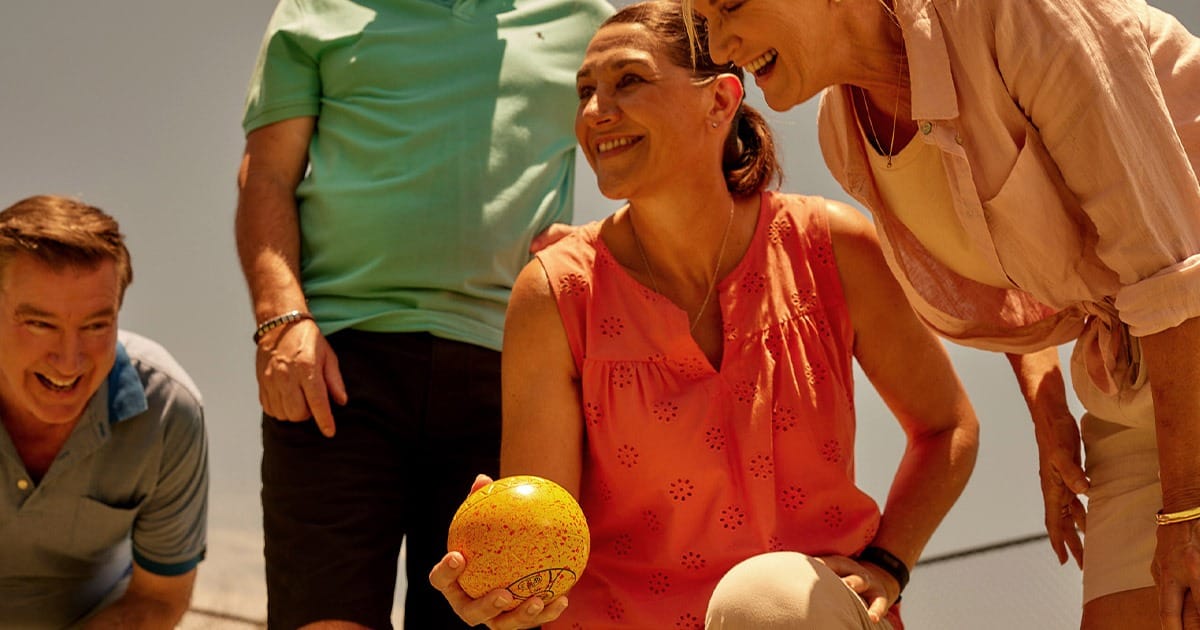
“It’s an exciting new era for Living Gems and the new look was created to mirror that. The colours, logo, and imagery have been crafted to reflect a positive, carefree and easy-going vibe – letting people know what kind of lifestyle they can expect in our over-50s communities,” he said.
In addition to the visual identity, a new television commercial campaign will be rolling out this month, as well as outdoor and print advertising, plus a beautifully designed website.
“Living Gems has a long, proud history creating over-50s communities of the highest standards. We are committed to delivering best-in-class lifestyle resorts with top quality homes for our residents,” Adrian said.
“We know from experience that one of the biggest regrets our homeowners have after moving into Living Gems is not having done it sooner.
“Time is our most precious resource – our resorts free up residents from the grind of ongoing home and garden maintenance, while giving them exclusive use of fitness and recreational facilities in a community of like-minded people,” he said.
“The Living Gems rebrand aims to capture the spirit of the fantastic lifestyle provided at our over-50s communities because right now is the time for living.”


